Colour Theory Explained:
Colour theory is a collection of guidelines created for designers to follow. Colour helps communicate to the target audience by creating visually appealing colour schemes. Colour can evoke a specific emotion from the audience so it is very important to have a good understanding of colour.
The Basics:
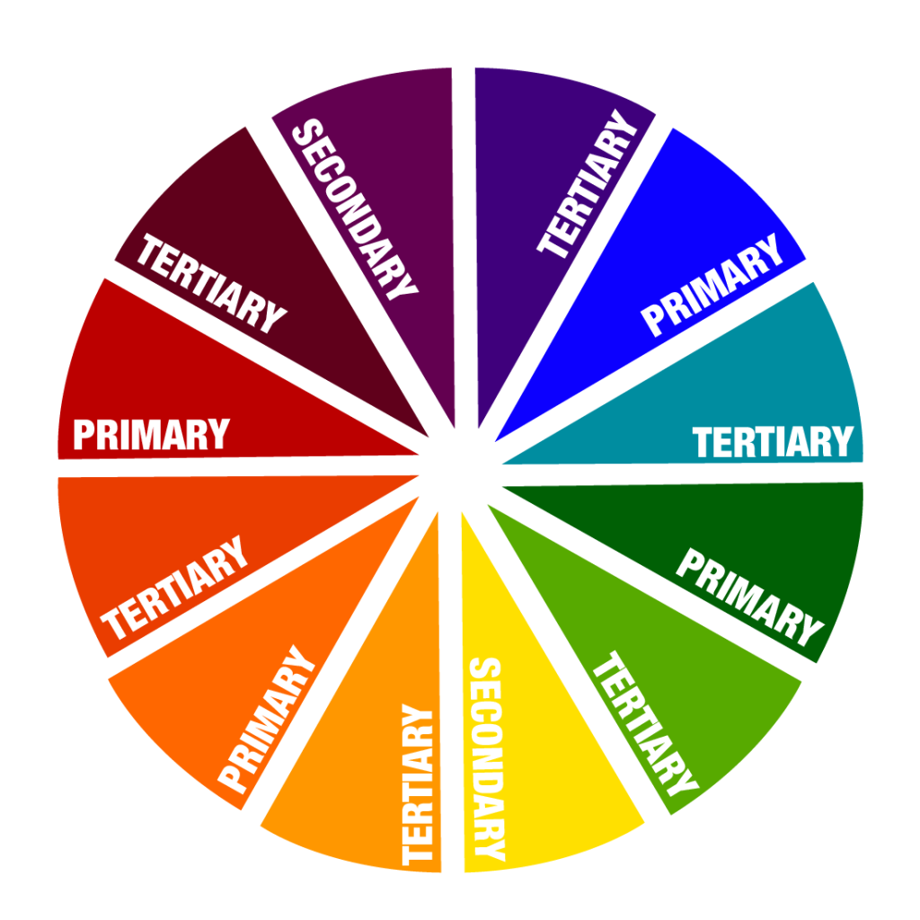
- Primary Colours – are red, yellow and blue. When mixed together, these colours create secondary colours.
- Secondary Colours – the colours created from mixing two primary colours together.
- Tertiary Colours – the colours created from mixing one primary colour together with a secondary colour.
- Colour Harmony – arrangements of colour in a design.
The Colour Wheel:
The Colour Wheel helps designers follow these guidelines. There are three versions of the colour wheel. One that contains just primary colours, another for secondary colours and the last for tertiary colours.
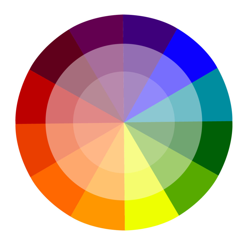
Colour Harmony:
Colour harmony is the arrangements of colour in a design. If the colours in a design are visually pleasing, then it would be a harmonious design. If the colours in a design are chaotic or boring, then it is not harmonious. It all depends on how the audience engages in the design. If the colours are boring on a design then there will be no engagement from the audience, the same way if it was chaotic, the viewers brain would reject the design and not engage with it. When a design is harmonious, it creates a sense of balance, allowing the brain to understand it.
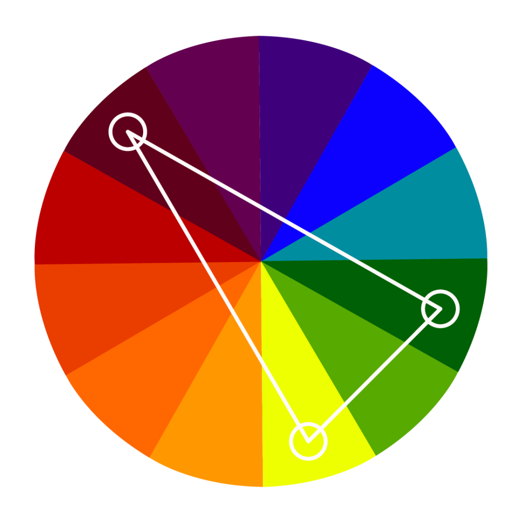
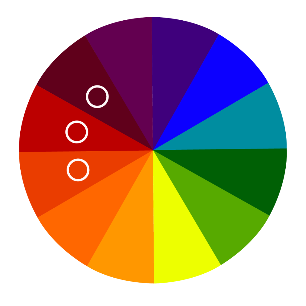
The Six Colour Harmonies:
- Complimentary: Colours that are located on the opposite side of the colour wheel. These colours could be vibrant, ideal for making something stand out or drawing attention to a focal point as it creates a high contrast. If a complimentary colour comes across too strong, adding black or white to make them feel more muted. It is typically used for youthful and lively projects.

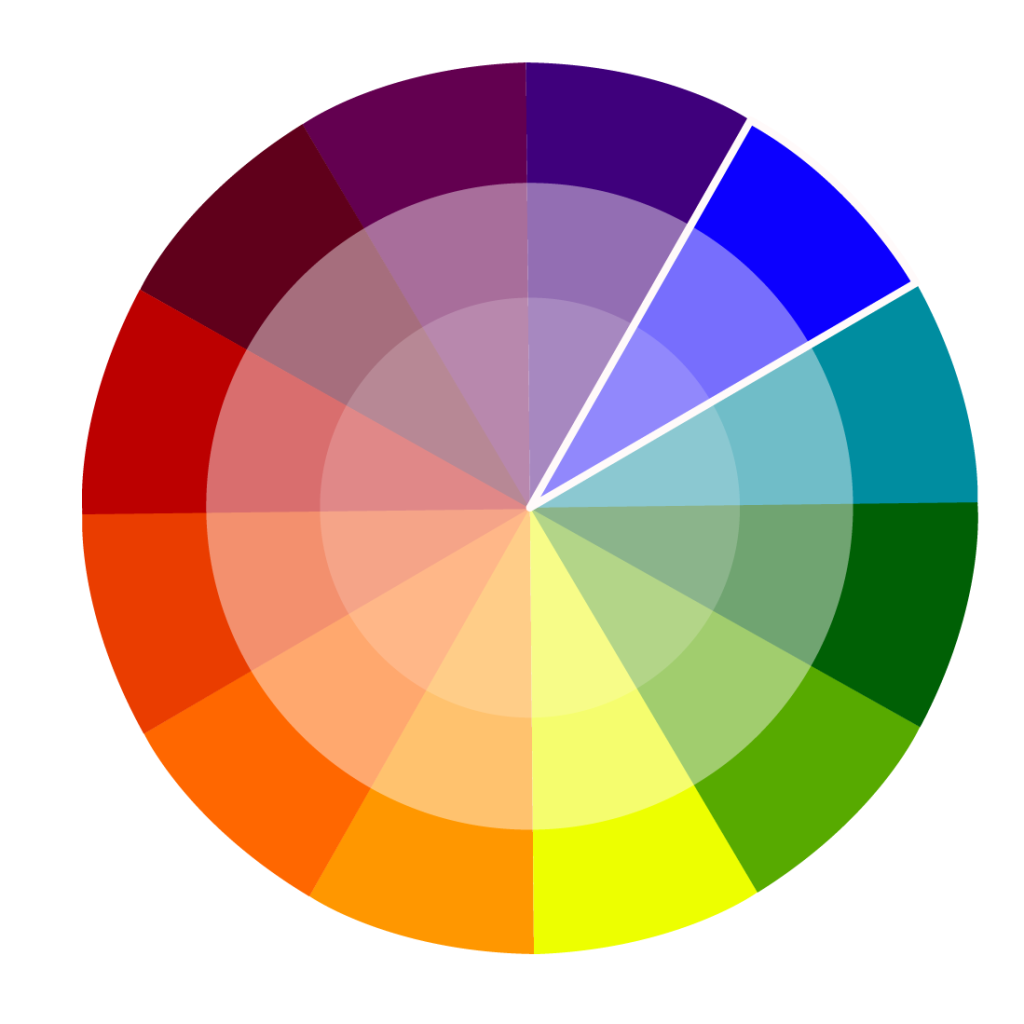
- Split Complimentary: Colours that are contrasted by using colours to the contrasting hue. It creates less tension as they tend to be less aggressive.
- Analogous: Colours that are a low contrast combination. Often found in nature and can create balance within the design. Sticking to only warm colours or only cool colours avoids complications.
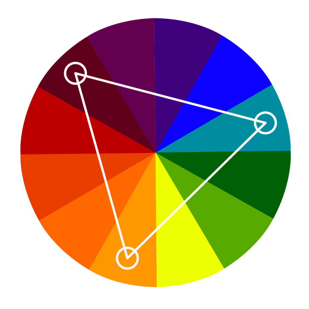
- Triadic: Consists of 3 colours that are evenly spaced around the colour wheel. One colour dominates and the other two work as accent colours. One dark colour and two paler shades. Tints and shades can create a sense of tranquillity where as full chrome hues create more lively concepts.
- Tetradic: Is when 4 colours are arranged in 2 complimentary pairs on the colour wheel, forming a square or a rectangle. This works well with flashier subjects as it can be very eye catching. However, using 4 different colours can make it difficult to get an effective balance. It is best for one colour to dominate and the other 3 can be used on secondary elements. Balancing cool and warm colours work to avoid being overwhelming.

- Monochromatic: A single colour shaded or tinted to various values by adding black or white. It creates a simple and clean aesthetic. It can offer a great sense of unity to the design although it can lack visual interest.
Summary:
As a designer, it is extremely important to have a complete understanding of the fundamentals of colour. If the colours used in a project aren’t suitable, there is more chance of failure. There would be less engagement from the target audience. However, a project that uses colours that are fit for the purpose will create more engagement from the right target audience and possibly even attract other attention. Without the correct knowledge on colour, projects can look messy, unprofessional and ugly. Knowing what colours go with others will help projects look more aesthetically pleasing and professional.